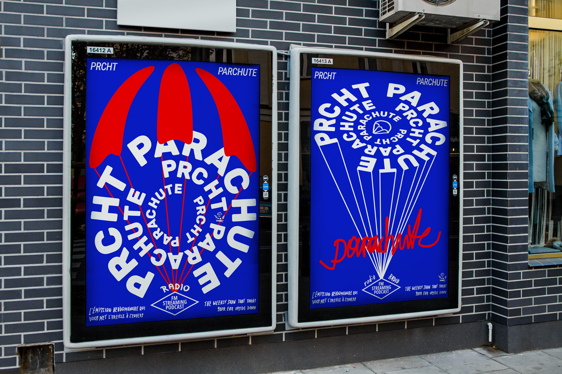
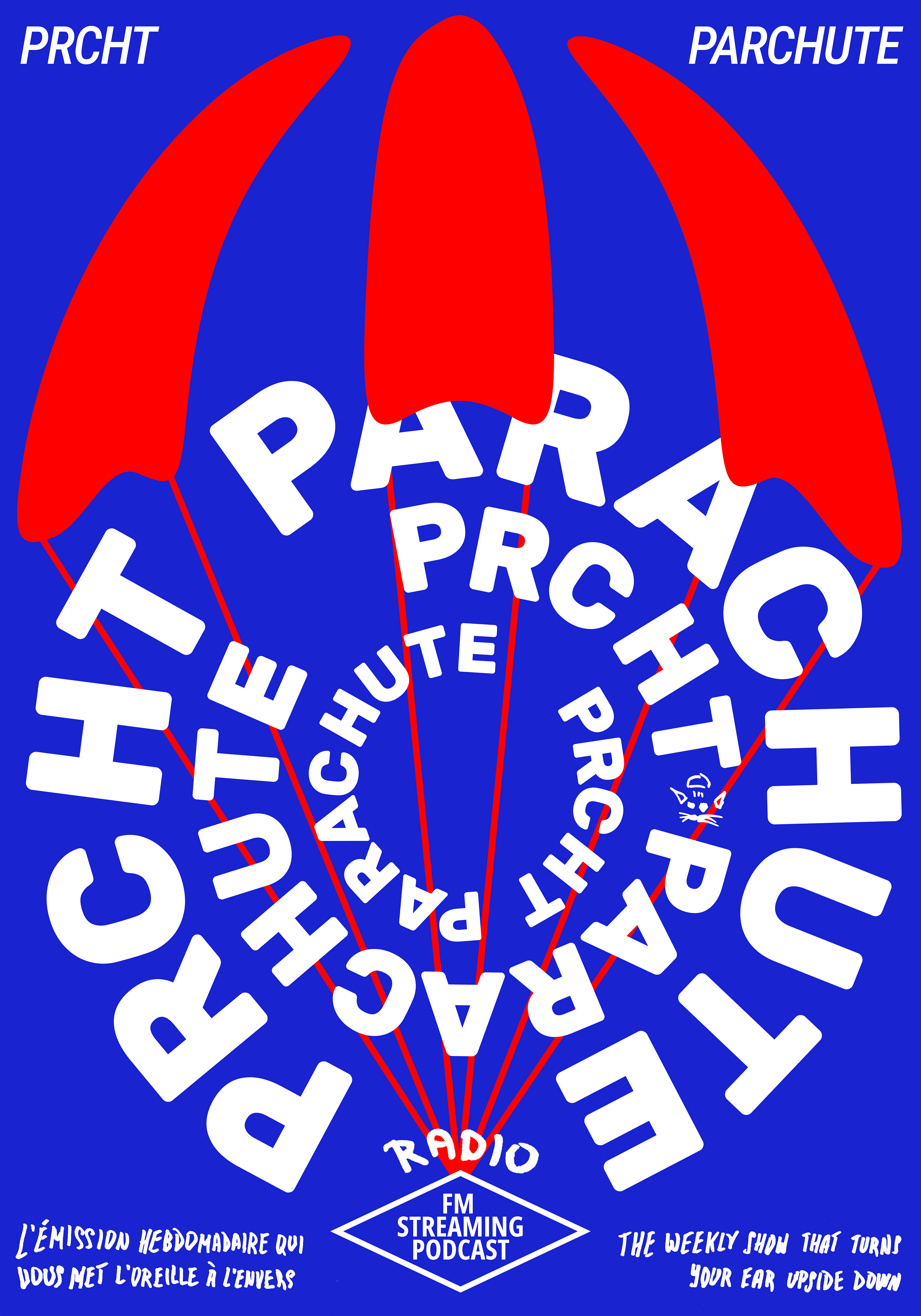
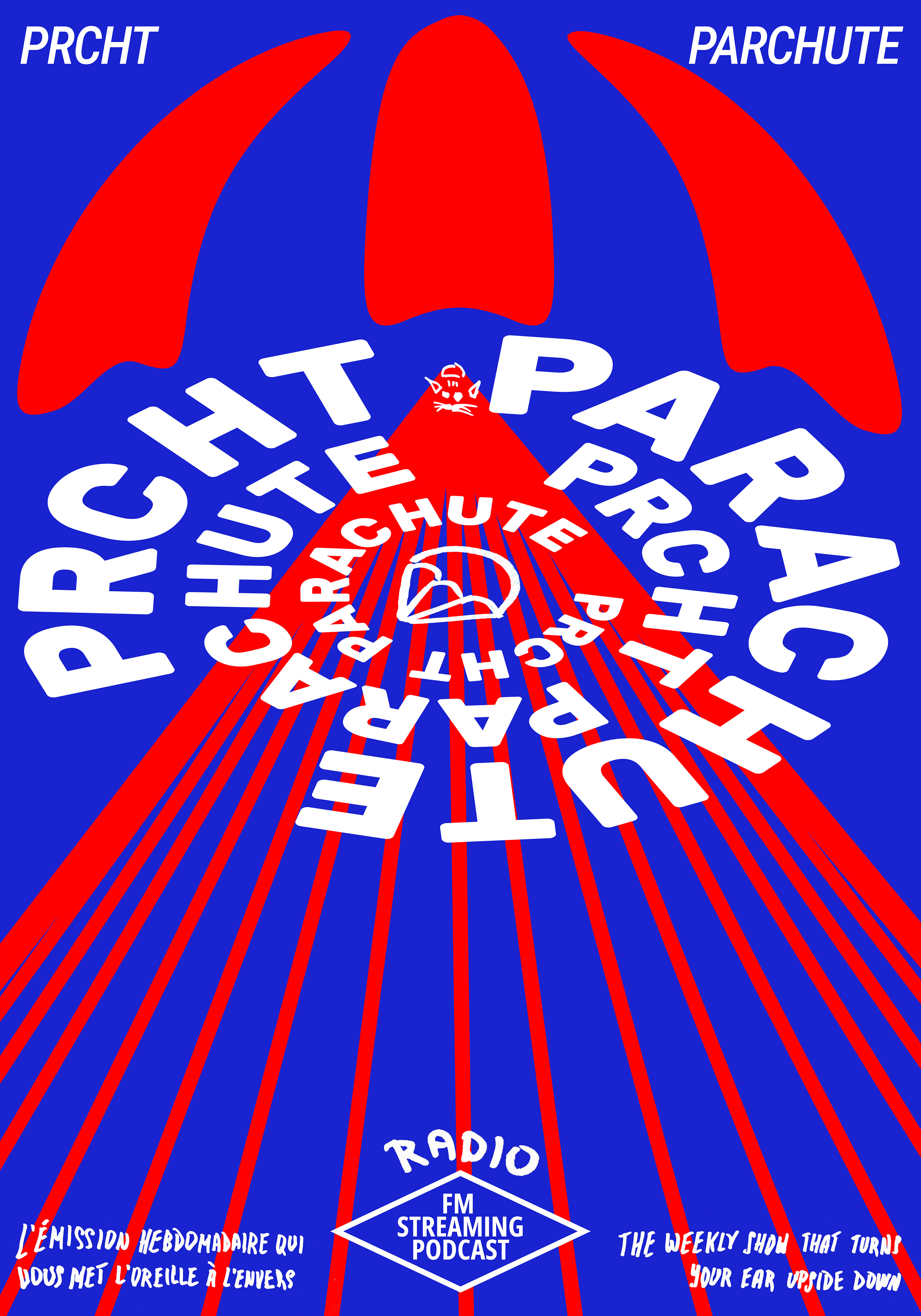
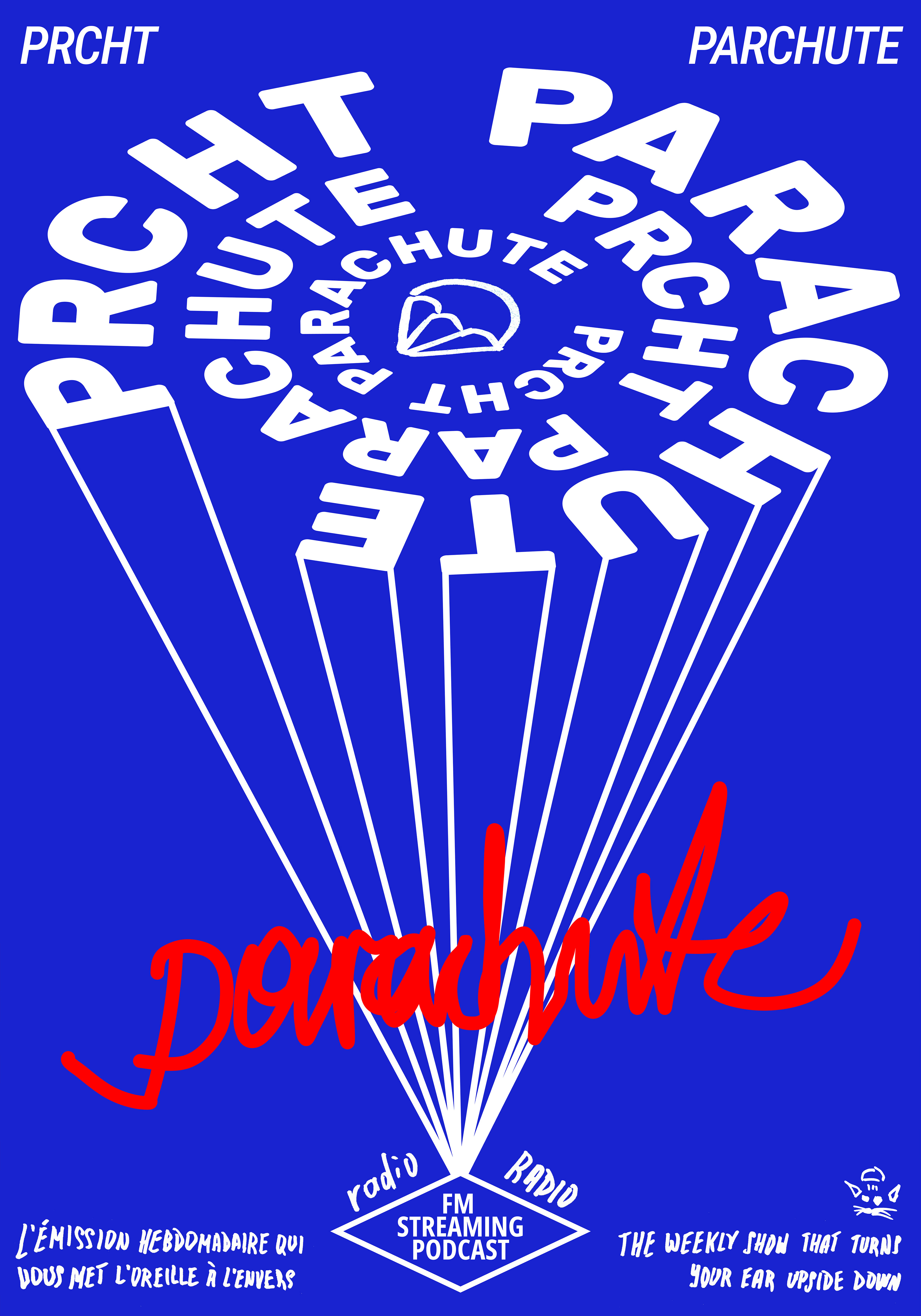
parachute fm podcast
charles taupin kindly asked me to design posters for his weekly french radio show “parachute” dedicated to new and inventive musics. i didn't think for long when i saw among the authors of posters such great designers as peter bankov and götz gramlich.
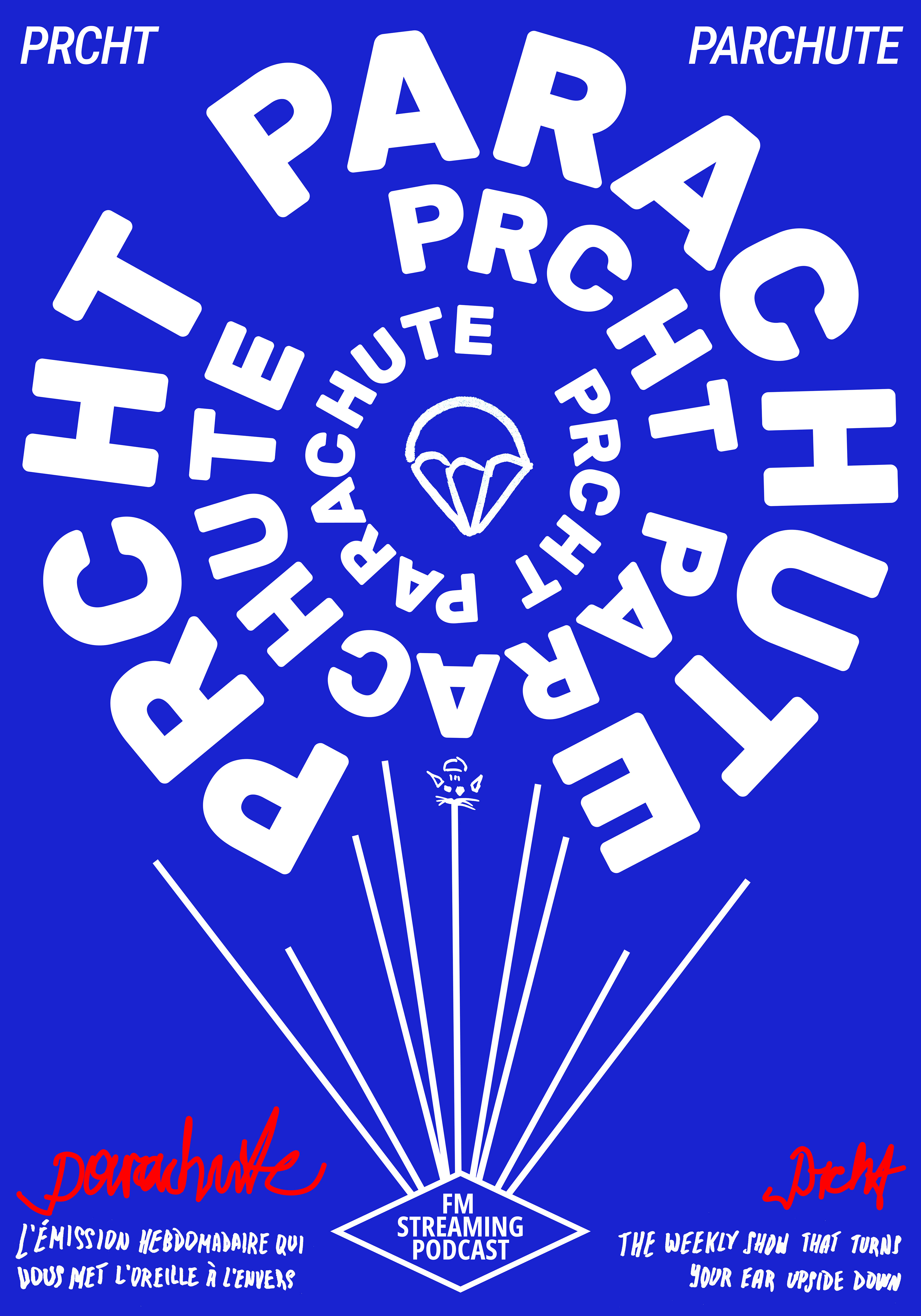
after some graphic research and a couple of hours of listening to the podcast, i began to design a series of posters guided by the principles:
— the parachute should be recognized from afar (and it would be recognized even if scaled down to a post stamp size);
— the work should look like french and smell like french (not italian or german);
— for me, the radio is something spinning in the air, so the letters are spinning in the air;
— parachute is a volunteer project, so the fonts in use should be open-licensed free fonts (that was the hardest part since the work depends heavily on the quality of the letters).