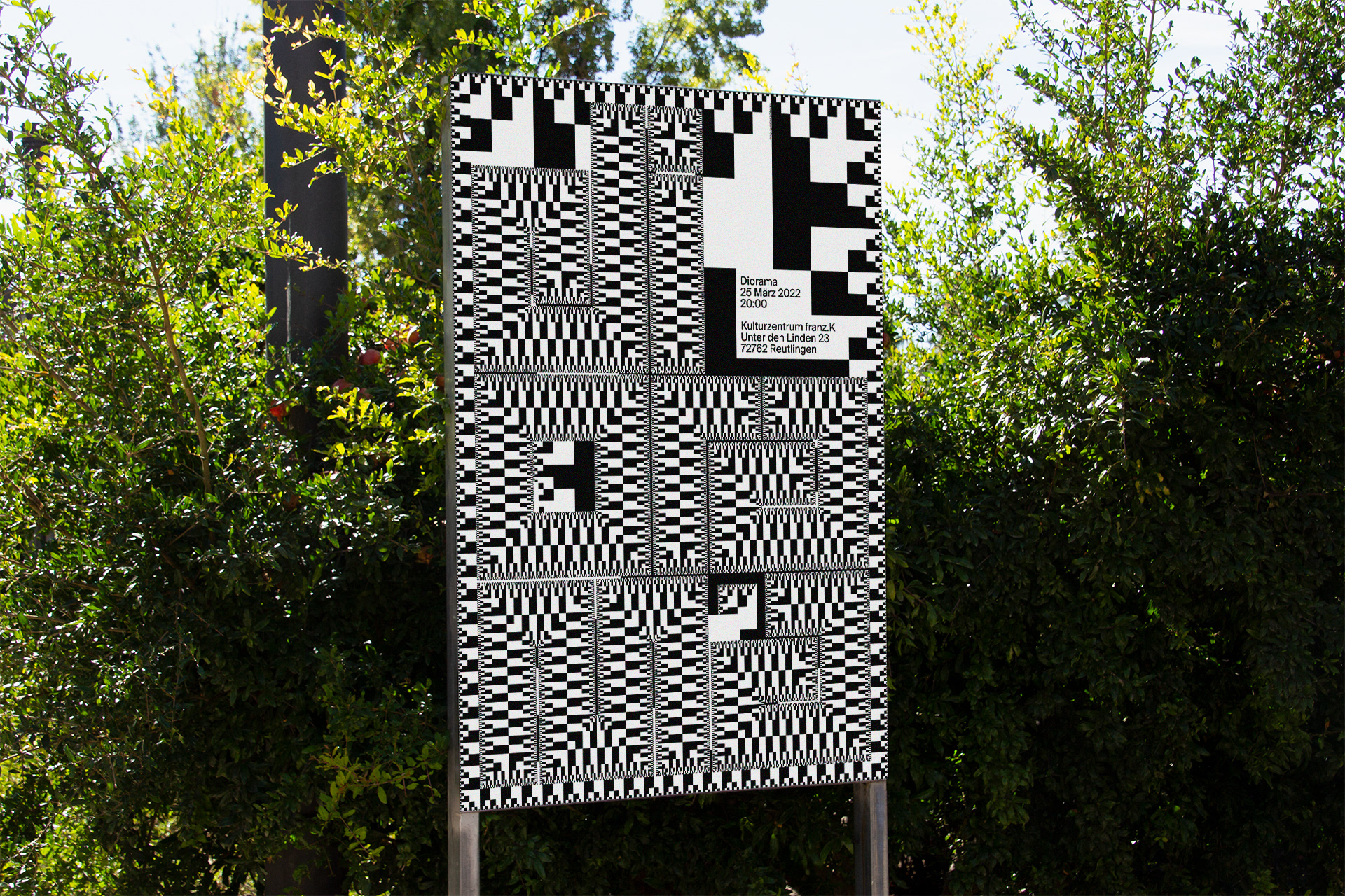
diorama (the band)
the project started as a self-initiated one, but became a real poster series for “diorama” and it's used by the band.
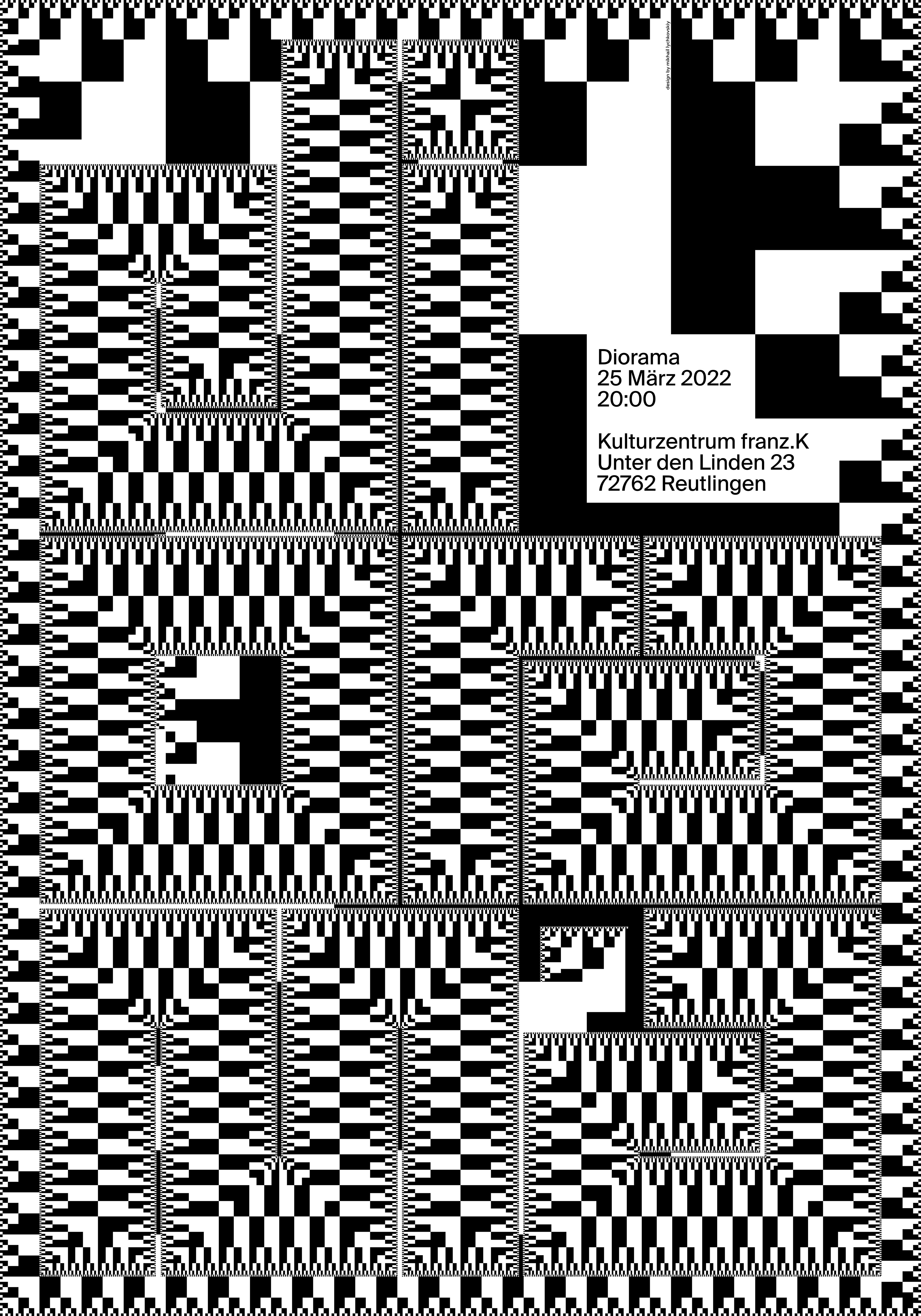
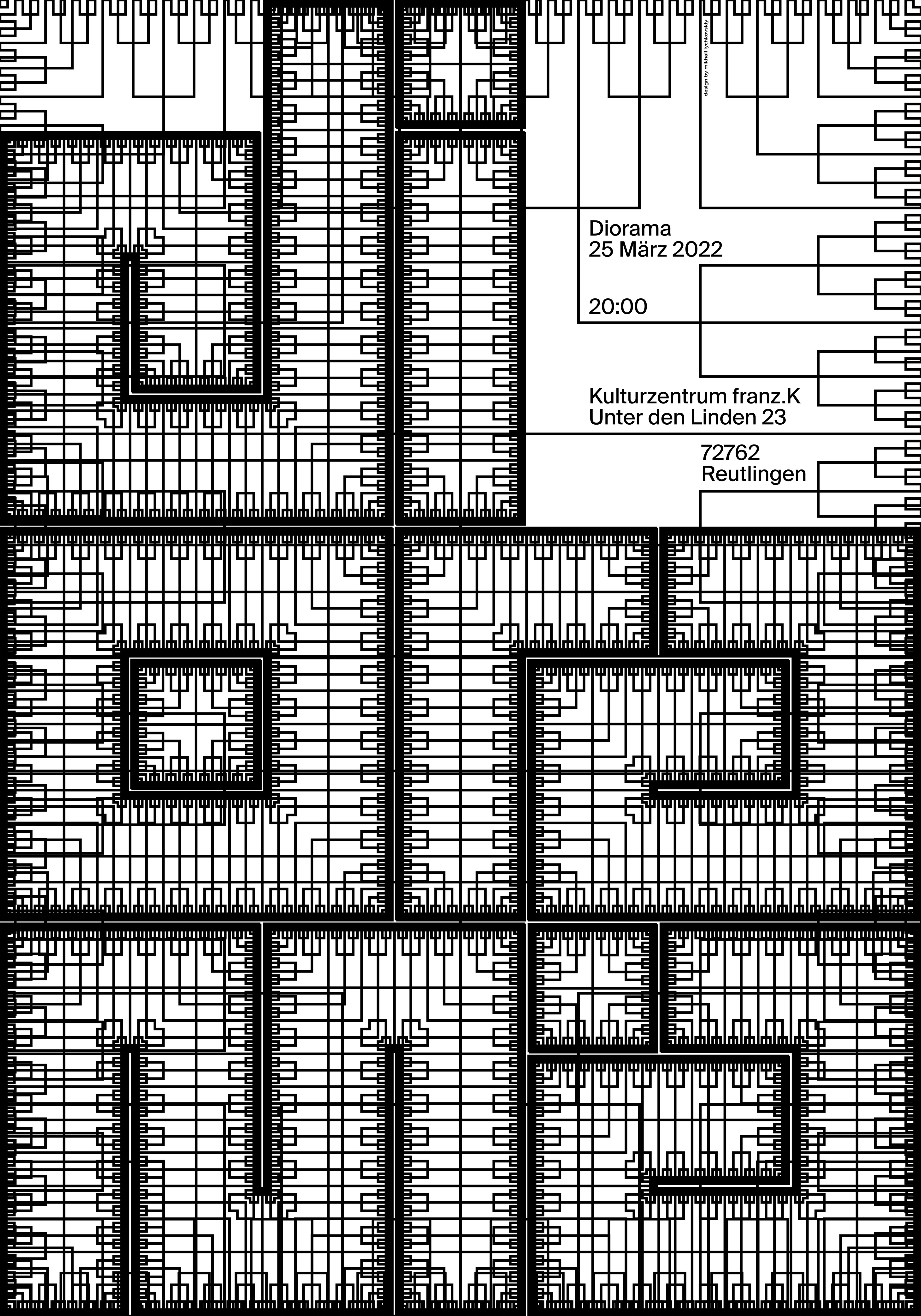
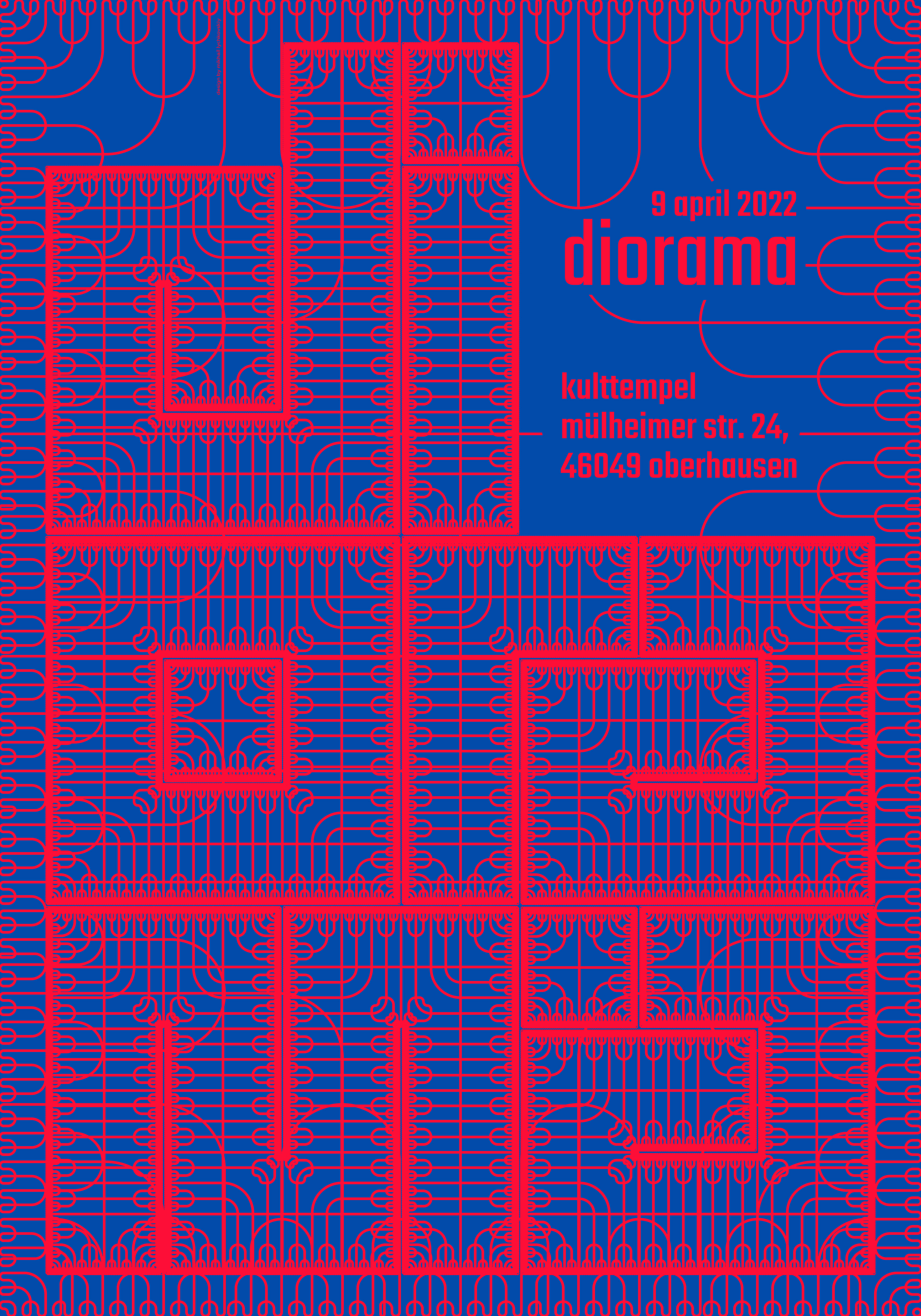
the goal was to reveal their sound in the sound of the poster. the idea lived without embodiment for a long time. the fractal. in fact, it turned out to be an homage to marvellous poster “frederik” by erich brechbuhl. but in this work, i turned the fractal inside out to make the form synonymous with the form of the poster.
principal type: fractal font by tibor lantos.
other type: for march event i used muller by fontfabric, for april — teko by indian type foundry (diorama asked me to change it to teko as it was their official type).